


Save For Later no. 19: We have a BRAND!
The process behind creating a new identity.


Today marks a significant milestone for me. The realization of what was once just an idea a few months back has now solidified into a fully-fledged food, travel, and photography business.
As part of building a business, you need to spend a significant amount of time and energy thinking about how you want to publicly display yourself and your brand to create consistency in your messaging. These decisions revolve around creating a persona that will be applied across your ecosystem - website, social media, print, and more.
There's something special about the process of visual branding - it not only captures the essence of the mission but also symbolizes a journey from concept to reality. I like to think of it as a journey because it's not just about getting from Point A to Point B; it's about how you get there - what you create, the processes you build, and the people you meet along the way all contribute to the overall success of an idea.
The journey of branding requires constant evolution. As your business grows, so does your brand. I consider it a living entity that needs care and attention, which involves observing trends, listening to feedback, and staying true to your core values. It’s crucial to ensure that your brand remains relevant and resonant with your audience; otherwise, you risk falling out of touch and behind the competition. This type of consistency builds trust and loyalty among your customers, turning them from passive readers into engaged community members. In my mind, the launch of this brand is only Day 1 in its journey.
One key theme that I love about this brand is its playfulness. This type of visual language communicates its essence at a glance, keeping it warm and inviting - starting with the color palette. The goal was to craft an identity that not only stood out but also conveyed the quality and creativity behind the brand.
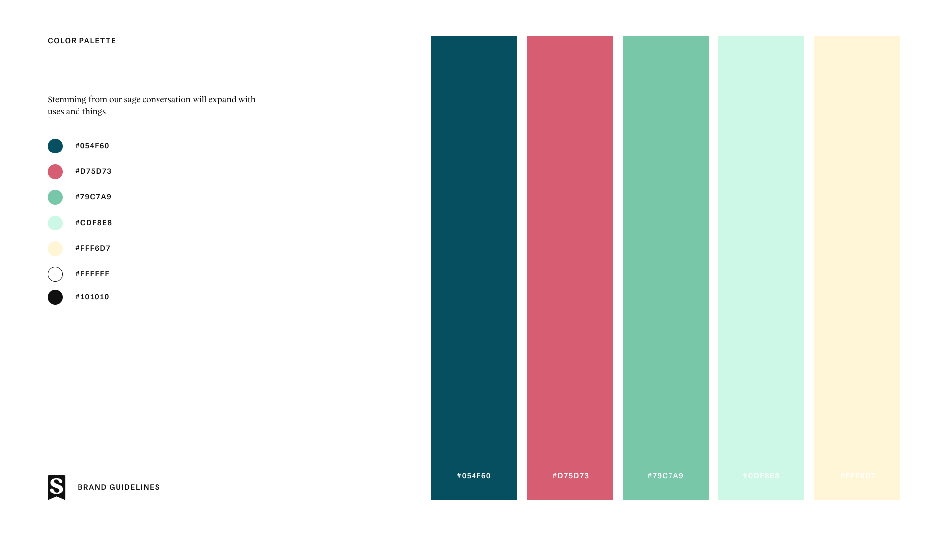
Iteration is crucial in the process of brand development. Originally, I had chosen a brighter and more colorful palette that was very vibrant, but I was quickly persuaded to reconsider. I’m glad I abandoned that route to focus on these colors instead, which are more refined, but still full of life. This evolution highlights the importance of being flexible and open to change during the branding process. It’s about striking the right balance between capturing attention and maintaining a sense of sophistication that appeals to a wide audience. Being adaptable and open to feedback early on allowed me to pivot and more accurately define my brand’s visual language, which I love.
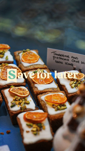
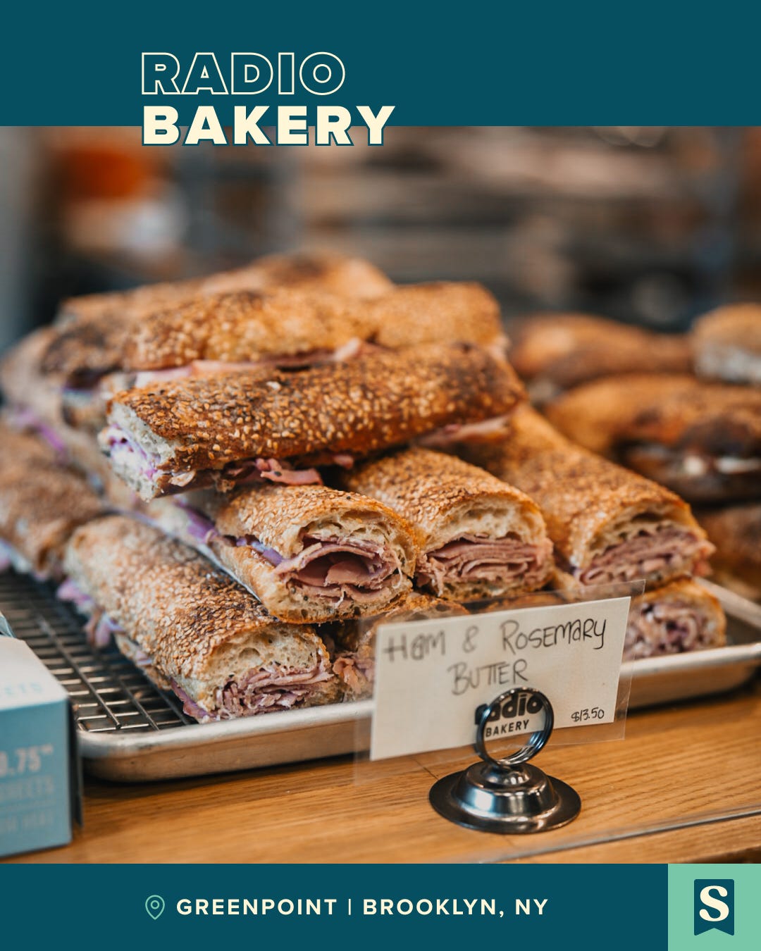
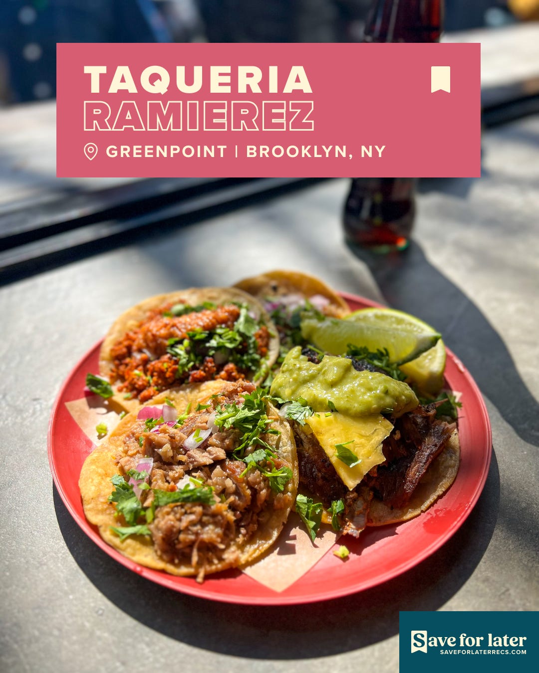
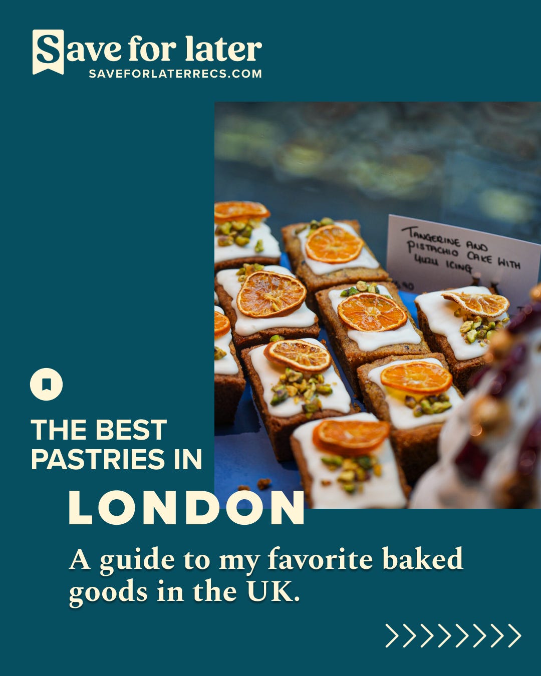
Once I established the brand guidelines, I needed to figure out how to apply them across various graphic design features, such as social media posts. One of the main visual elements I wanted to include was the use of a bookmark, widely recognized as an icon for the act of ‘saving’ something. It symbolizes the idea of “I’ll come back to it,” which perfectly aligns with the essence of the Save For Later brand. Incorporating such an accepted icon into the brand identity showcases the brand meaning that goes beyond just aesthetics.
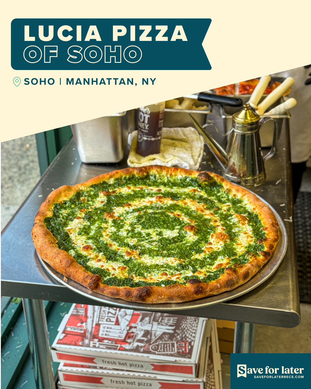
It took iterating through about six design concepts before I settled on this initial option, and I'm really happy with the outcome. At first, I hadn't planned on embracing outlined text, but after browsing Pinterest for design inspiration, I found some compelling use cases for the application. I loved the effect once I implemented it. The way the inverted text complements the font choice really caught my eye - it's bold, eye-catching, and easy to read - a perfect combination to make the typical social media scroller pause, even if just for a moment. At least, that's my hope.
Over the last few months, I've noticed that many of the posts I share online are static food images, which don't tend to perform very well. A typical Instagram user is also prone to skip reading the caption of a post, where I usually include important details about a restaurant, business, or travel location - like their name, tag, and location. That's why I'm excited about how this graphic design approach elevates that information visually. It serves as an accent while still highlighting the food photo itself.
As the brand continues to evolve, my focus remains on how each element contributes to a cohesive narrative. By pausing to conduct some market research and refining my approach, I've begun to understand what resonates with my audience and how to tailor my social media presence towards a more editorial-driven approach. Given that much of the content I create (and have created) is primarily static, I'm exploring ways to integrate photo stills with video. This will allow me to utilize my photo library stills effectively within the algorithms that favor dynamic content.
Similarly, by incorporating the restaurant name and location directly into my social media posts, it provides additional context for users when they share these images via direct messages with friends. My aim is to streamline the saving and sharing process, creating a recognizable and easily searchable graphic for when someone revisits their saved folders.
In weaving these elements together, the brand becomes more than just a visual element - it helps build a trusted community around my recommendations, the customer journey and my brand. I want to promise not just quality and creativity, but also a shared adventure around food, travel and photography.
Lastly, one area I wanted to start focusing more on was guides and roundup-style posts. I needed to begin integrating these strategic content pieces to provide a certain level of value to my audience beyond single, one-off posts. These guides will focus on themes, such as:
Where to Find the Best Dishes I Ate in February
A Guide to the Best Pastries in London
Where to Get the Best Tacos in NYC
Which Hikes are Worth Exploring at Olympic National Park
And more
These types of posts not only help in consolidating information on particular themes or locations but also position my brand as a go-to resource for insightful recommendations and tips. Curating this type of content is important and will fill a void that I'm currently missing on certain platforms.
Overall, building this brand over the last month has been a rewarding experience, and I'm thrilled with the results. The journey from conceptualizing the brand's identity to seeing it come alive has been both challenging and fun, and I loved digging into the process. I honestly surprised myself with just how creative I can be.
My goal now is to continue elevating the brand to new heights in the coming months and to explore innovative ways to connect with my audience. This includes enhancing Save For Later's digital presence through interactive content and building a larger community around the brand values. This is just the beginning of the journey, and I'm committed to seeing this through. I'm excited to discover what makes this brand truly special and to see where this adventure takes us. Thanks for being here.
Final Thoughts
A major shoutout goes to my good friend, Kyle, for bringing this brand to life and giving it meaning. He coordinated the full design system and color scheme for me to run with, which speaks volumes and gives my work a distinct character. Thank you for being so talented.
I'm beyond excited for this next chapter of Save For Later and looking forward to sharing more recommendations and captivating photography with you. If you, or someone you know, needs any photographs done - portraits, food, restaurants, pop-ups, or anything else - please don’t hesitate to reach out!
As always, if you have any recommendations or feedback to share, please feel free to connect with me.
My email is saveforlaterrecs@substack.com or DM + follow us on Instagram & TikTok
See you next time ✌️
Want to forward this email or share the post to a friend? Go for it.
This really looks great! Your word mark and logo mark look very cohesive and professional.
Love the new look